HPEI Case Study: Home & Decor
Human Product Emotion Interaction · Emotion Index · PEG Filter · P²VP Persona
| Brief ID | Category | Framework version | Date |
|---|---|---|---|
| HPEI-HD-001 | Home & Decor / Interiors | TrendClass v1.0 | April 2026 |
Emotion Index (EI) — Circumplex Positioning
Each space is positioned on the Arousal × Pleasure circumplex. This position governs all downstream HPEI decisions — material palette, surface texture, spatial rhythm, and sensory signature. Research: Mehrabian & Russell (1974) arousal-valence model; Kahneman (2011) System 1 environmental priming.
| EI Dimension | Space 01 — Japandi Living Room | Space 02 — Wabi-Sabi Kitchen |
|---|---|---|
| EI Position | Serenity | Comfort |
| Arousal Level | Low Arousal | Low-Moderate Arousal |
| Pleasure Valence | High Pleasure | High Pleasure |
| EI Position Code | Low Arousal + High Pleasure Essentialist Sage register | Low-Moderate Arousal + High Pleasure Caregiver / Romantic register |
| Circumplex Quadrant | Lower-right — Contentment zone (calm, pleasurable, restorative) | Lower-centre-right — Warmth zone (quietly stimulating, nourishing) |
| Primary Archetype | The Sage / The Innocent (Jung / Pearson) | The Caregiver / The Lover (Jung / Pearson) |
| Research Basis | Mehrabian & Russell (1974): low-arousal positive environments activate restorative attention (Kaplan, 1989 ART theory). | Warm material tones (travertine, oak) correlate with safety and belonging needs (Maslow, 1943 — Levels 2-3). |
EI Justification — Space 01
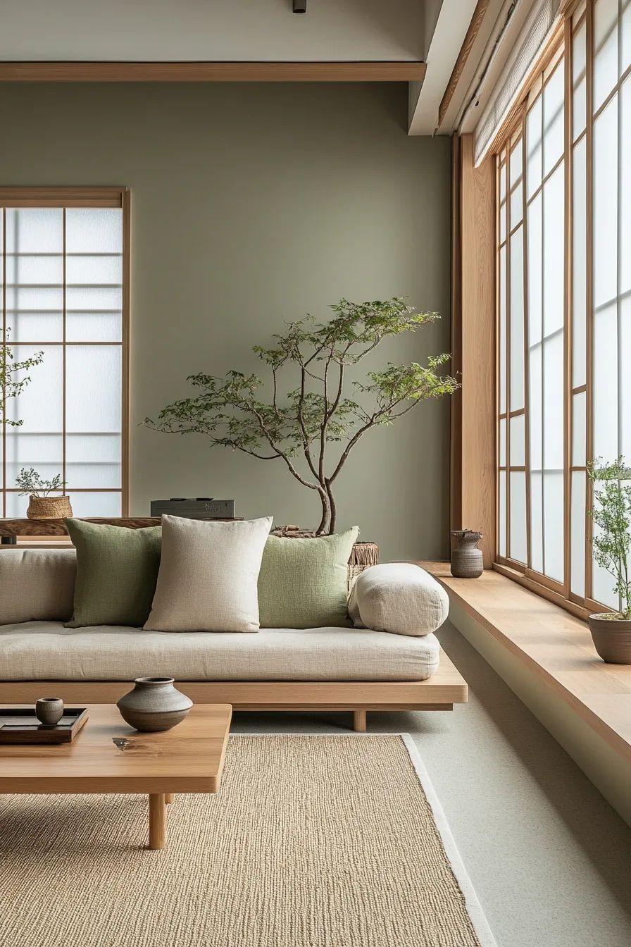
Sage green walls (low-saturation, low-brightness) with pale oak and natural jute occupy the lowest-arousal positive zone on the Mehrabian-Russell scale. The bonsai tree — a slow, living, impermanent object — anchors biophilic serenity (Kaplan's Attention Restoration Theory, 1989). Shoji screen diffused light eliminates harsh shadows, suppressing the sympathetic nervous system activation that high-contrast environments trigger. The emotional register is Serenity: deliberate, sustained, restorative.
EI Justification — Space 02
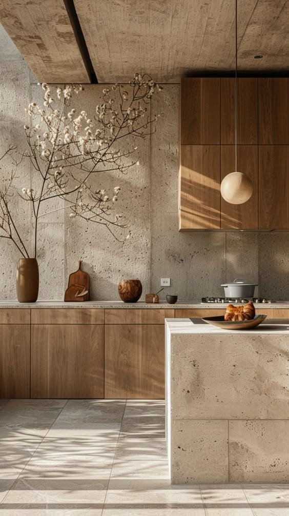
Travertine stone (warm beige, pitted texture) and warm-toned oak cabinetry sit just above pure serenity on the arousal axis — the textural complexity of raw stone provides a mild stimulation that keeps the space from feeling sterile. The pendant sphere lamp and cotton-branch arrangement create a domestic warmth that activates Maslow's safety and belonging needs simultaneously. The emotional register is Comfort: nourishing, grounded, quietly pleasurable.
PEG Filter — Positive Emotion Granularity
PEG Principle: Replace vague design intent ("calm", "natural", "luxurious") with a single named emotion from the 25-typology. All downstream decisions — material palette, spatial rhythm, surface finish, lighting — are evaluated against the named emotion, not aesthetic preference.
| Consumer Purpose | "I want to come home and feel the world slow down — as if the room itself exhales for me." | "This kitchen should feel like a ritual, not a task. Cooking here is pleasure, not obligation." |
| 25-Typology Cluster | Well-Being cluster — Serenity / Safety Secondary: Optimism — Delight | Well-Being cluster — Comfort / Safety Secondary: Affection — Tenderness |
| Primary Emotion | SERENITY | COMFORT |
| Secondary Emotion | Delight (Whimsy / Optimism) | Tenderness (Affection) |
PEG Translation — Space 01: Japandi Living Room
| Vague brief | PEG-refined emotion | Resulting design decision |
|---|---|---|
| "Make it feel calm" | Serenity (Well-Being) | Sage green walls, low saturation, matte finish. Zero high-contrast patterns. Diffused shoji light eliminates harsh shadows. |
| "Make it feel natural" | Delight (Whimsy / Optimism) | Living bonsai tree as centrepiece — impermanent, organic, seasonally alive. Jute rug provides tactual earth connection. |
| "Make it feel minimal" | Safety (Well-Being) | Pale oak low-profile sofa frame — no heavy legs, no visual weight above eye level. Generous negative space signals psychological safety. |
PEG Translation — Space 02: Wabi-Sabi Kitchen
| Vague brief | PEG-refined emotion | Resulting design decision |
|---|---|---|
| "Make it feel warm" | Comfort (Well-Being) | Warm oak cabinetry with natural grain visible. Amber-toned pendant lamp. Travertine stone with pitted texture — warmth through material memory. |
| "Make it feel luxurious" | Tenderness (Affection) | Organic cotton-branch vase arrangement — impermanent natural beauty. Wooden serving bowl and cutting board as functional objects with sensory warmth. |
| "Make it feel earthy" | Safety (Well-Being) | Raw concrete ceiling — tactual weight overhead signals permanence. Travertine island: geological time materialised in a domestic space. |
P²VP Consumer Persona — Personality × Purpose × Value × Product
P²VP Principle: Every interior space tells an emotional story. The same material palette triggers entirely different emotions depending on the Personality and Purpose of the inhabitant. All HPEI decisions are evaluated against the target persona. Jungian basis: Mark & Pearson (2001). Trait basis: Costa & McCrae (1992).
Essentialist Sage / Quiet Restorer
Grounded Sensualist / Conscious Cook
HPEI Dimension Specification — Visual · Tactual · Multi-Sensory · Audio
Every interior design brief must specify all active HPEI dimensions. For each dimension, the named emotion from Section 02 is translated into concrete material and spatial decisions. The emotion specification overrides aesthetic preference.
| Dimension | Space 01 — Japandi Living Room | Space 02 — Wabi-Sabi Kitchen |
|---|---|---|
| Visual Colour Palette | Sage green walls: B ~48%, S ~22% — deliberately de-saturated to suppress arousal. Pale oak (B ~75%, S ~8%) + natural linen (B ~85%, S ~5%). Colour story: muted terrestrial — colours that have aged and settled into the earth. Zero chromatic excitement. Emotion delivered: Serenity through chromatic restraint. | Travertine beige (B ~72%, S ~10%) + warm oak (B ~55%, S ~20%) + concrete grey (B ~45%, S ~5%). Amber pendant: B ~65%, S ~45% — the only warm accent, functioning as visual hearth. Emotion delivered: Comfort through warm-neutral material palette that reads as geological memory. |
| Visual Spatial Rhythm | Balanced spatial rhythm — controlled density. Low furniture profile keeps sightlines open. Generous negative space on walls: sage green is the breathing room, not a decorative statement. Horizontal lines (sofa frame, coffee table, window bench) reinforce calm visual grammar. The bonsai tree introduces the only organic asymmetry — Delight through natural contrast. | Dense at counter level, open at ceiling — creates a visual "settling" from heavy sky to active surface. Raw concrete ceiling functions as visual weight that grounds the space. Island form: rectilinear, precise, geologically patient. Objects on counter (vase, bowl, board) create a domestic still-life rhythm — Tenderness through material arrangement. |
| Tactual Surface Texture | Jute rug: coarse, tactual, anchoring — activates foot-to-ground earth connection. Linen cushions: mid-weight, slightly nubby — Comfort at point of contact. Oak sofa frame: smooth, warm, with visible grain — material warmth without weight. Ceramic vessels: hand-thrown irregularity signals craft over industrial production. Emotion at touch: held, safe, grounded. | Travertine: cool, pitted, geologically textured — weight and permanence in the hand. Oak cabinet fronts: smooth grain, warm to touch — domestic familiarity. Ceramic vase: organic curves, earthy glaze — Tenderness in the hand. Wooden cutting board and bowl: warm, porous, biophilic — the kitchen rewards touch. Emotion at touch: nourished, deliberately material. |
| Tactual Material Finish | Matte throughout — walls, sofa fabric, ceramic vessels. No reflective surfaces at eye level. Embellishment: none. The bonsai container: weathered dark stoneware — restraint signals deep attention. The absence of shine is a deliberate Serenity signal (shine = excitement; matte = authority and calm). | Travertine: natural honed finish — matte with visible pitting. Oak cabinetry: natural oil finish, visible grain, low sheen. Pendant: opal sphere — soft diffused glow, not specular. Contrast: concrete ceiling is raw and unfinished — the roughness is the finish. Material honesty is the embellishment. |
| Multi-Sensory Spatial Experience | The room's spatial experience slows the body. Low furniture reduces physical activity. Diffused light through shoji removes directional shadows — time becomes ambiguous. The bonsai requires attention without demanding it: it is a living companion, not a spectacle. Movement: slow, deliberate, shoeless (floor-level domestic culture implied by low sofa). Wearing verdict: "I am not required to perform here. I can simply be." | The kitchen's spatial experience grounds the body. Stone and concrete have physical weight that the inhabitant unconsciously registers as permanence. Cooking here is a sensory ritual — the warm oak, the cool stone, the pendant's warm light all activate different sensory registers simultaneously. The space rewards slow cooking, not efficiency. Wearing verdict: "This is where I make things with my hands, and that is enough." |
| Audio Sensory Signature | Silent — deliberate absence of audio stimulation. Jute rug absorbs footfall — footsteps disappear. Shoji screens diffuse exterior noise. The only sound: ambient natural (potential wind in bonsai branches). Audio intent: Quiet authority. The room earns its silence. | Soft — domestic audio signature. Natural tile floor: quiet footfall, slightly resonant — not clinical. Stone surfaces: solid thud of objects placed — material permanence in sound. Pendant lamp: no sound, but its warm glow creates acoustic warmth by association. Audio intent: Domestic comfort. The kitchen sounds like home. |
Thick Idea — Emotional Architecture & Sequence
The emotion sequence maps the inhabitant's emotional journey from first visual encounter through tactual engagement to the definitive spatial verdict — the emotional state the space produces when inhabited over time.
Space 01 — Emotion Sequence: Japandi Living Room
| First encounter (visual at threshold) | Point of contact (tactual engagement) | Inhabiting verdict (multi-sensory) |
|---|---|---|
| Serenity. Low-saturation sage green and pale oak at threshold — the room's chromatic restraint immediately suppresses sympathetic arousal. The eye finds no focal point demanding attention. | Safety. Jute rug under foot, linen cushion in hand — coarse natural textures activate earth-connection. The sofa's low profile invites horizontal repose. | Delight. The bonsai tree resolves the visual field — a living organism introducing temporal awareness. The inhabitant relaxes into the room's rhythm. |
| Q2 — HPEI Visual carriers | Sage green → Serenity. Pale oak → Safety. Shoji diffused light → Temporal ambiguity / Delight. Jute rug → Earth-connection grounding. |
| Q3 — HPEI Tactual carriers | Linen cushion → Comfort at contact. Jute rug → Tactual earth. Ceramic vessel irregularity → Craft serenity. Low oak frame → Physical settling. |
| Q4 — Multi-sensory spatial experience | The space requires nothing of the inhabitant. Low furniture = horizontal posture = physiological rest. Diffused light = no urgency. Living bonsai = presence without demand. The room produces Serenity not through absence but through considered restraint at every material decision. |
| Q5 — Deep inhabitant concern addressed | Chronic overstimulation from professional and digital environments. The fear that rest is unearned. This space addresses the deep need for permission to be unproductive — granted by the room's architecture itself. |
Space 02 — Emotion Sequence: Wabi-Sabi Kitchen
| First encounter (visual at threshold) | Point of contact (tactual engagement) | Inhabiting verdict (multi-sensory) |
|---|---|---|
| Comfort. Warm travertine and oak at threshold — geological warmth activates safety response before any cognitive evaluation occurs. The space reads as permanent and trustworthy. | Tenderness. Oak cabinet front warm under hand, stone island cool and substantial — the sensory contrast activates full tactual presence. The cotton branch arrangement introduces ephemeral beauty. | Delight. Warm pendant light pools on stone surface — the play of natural shadows creates a domestic intimacy that rewards slow attention and rewards the act of cooking. |
| Q2 — HPEI Visual carriers | Travertine beige → Comfort / Safety. Warm oak → Tenderness. Amber pendant → Warmth / Hearth. Cotton branch → Impermanent Delight. |
| Q3 — HPEI Tactual carriers | Travertine pitting → Geological weight / Safety. Oak grain → Domestic warmth. Ceramic vase → Tenderness in hand. Wooden objects → Biophilic Comfort. |
| Q4 — Multi-sensory spatial experience | The kitchen rewards sensory engagement rather than efficiency. Cooking in this space is a ritual: the stone is cool, the wood is warm, the pendant is golden. Each material registers differently at touch. The space produces Comfort not through softness but through material honesty and the deep pleasure of surfaces that have earned their place. |
| Q5 — Deep inhabitant concern addressed | The alienation of industrial domestic spaces that reduce cooking to task-completion. The fear that beauty has no place in the functional rooms of daily life. This kitchen addresses the desire for a domestic life that is also a sensory life. |
Final Design Brief — Summary Output
Synthesises all previous sections into a single actionable brief for interior designers, procurement teams, and brand communication. Every decision tested against the named emotion.
Japandi Living Room — Serenity + Delight
"This space targets Serenity with a secondary register of Delight — delivered through low-saturation sage green, pale oak restraint, diffused shoji light, and a living bonsai as the room's only temporal statement."
Essentialist Sage / Quiet Restorer — The Sage archetype — Low Arousal + High Pleasure — Purpose: neurological decompression in domestic space.
- + Matte surface finishes throughout
- + Low-saturation earth tones
- + Living / biophilic elements
- + Horizontal furniture profiles
- + Natural fibre textiles (jute, linen, cotton)
- + Hand-crafted ceramic and clay objects
- + Diffused or indirect lighting only
- - Shine or gloss surfaces (signals excitement)
- - Saturated or bright colour accents
- - Tall furniture or high visual lines
- - Synthetic materials (breaks material authenticity)
- - Spotlighting or directional shadows
- - Maximalist object density
This brief targets the Essentialist Sage consumer — Jungian Sage / Innocent archetype — positioned at Low Arousal + High Pleasure. Primary emotion: Serenity. Secondary: Delight. HPEI Visual: sage green matte walls, pale oak restraint, zero chromatic excitement, living bonsai as temporal anchor. HPEI Tactual: jute, linen, hand-thrown ceramic, smooth grain oak — all matte, all honest. Multi-sensory verdict: the inhabitant slows down involuntarily. The room grants permission to rest. The bonsai is the only thing moving, and it does so at geological pace.
Wabi-Sabi Kitchen — Comfort + Tenderness
"This space targets Comfort with a secondary register of Tenderness — delivered through travertine permanence, warm oak domesticity, raw concrete geological weight, and material objects chosen for their sensory honesty."
Grounded Sensualist / Conscious Cook — The Caregiver / Lover archetype — Low-Moderate Arousal + High Pleasure — Purpose: domestic ritual elevated to sensory practice.
- + Honed or natural matte stone surfaces
- + Warm-toned wood with visible grain
- + Natural oil or wax finishes on wood
- + Organic cotton / dried botanical arrangements
- + Handmade ceramic objects
- + Warm pendant / ambient lighting
- + Raw or exposed structural materials
- - Polished or gloss stone (removes geological authenticity)
- - White gloss cabinetry (clinical, cold)
- - Stainless steel maximalism (industrial, cold)
- - Synthetic worktop materials
- - Cool fluorescent or bright LED lighting
- - Symmetrical or overly ordered object placement
This brief targets the Grounded Sensualist consumer — Jungian Caregiver / Lover archetype — positioned at Low-Moderate Arousal + High Pleasure. Primary emotion: Comfort. Secondary: Tenderness. HPEI Visual: travertine beige, warm oak, raw concrete geological weight, amber pendant warmth, cotton branch ephemerality. HPEI Tactual: cool stone + warm wood contrast, pitted travertine, porous wooden objects — every surface honest about what it is. Multi-sensory verdict: the kitchen produces comfort not through softness but through material truth. Each surface registers differently at touch, and the inhabitant is rewarded for paying attention.
Apply This Framework to Your Product Category
This case study demonstrates one application of the HPEI system. The full framework — Emotion Index, PEG Filter, P²VP Persona, and Dimension Specification — is available in the F-Trend book and taught in the TrendClass certification program.
The HPEI Framework Book
Complete methodology. 25-emotion typology. Dimension specification templates. Work at your own pace.
View Book →TrendClass Certification
Live instruction. Applied projects. Professional certification. The complete system, mentored.
View Program →