
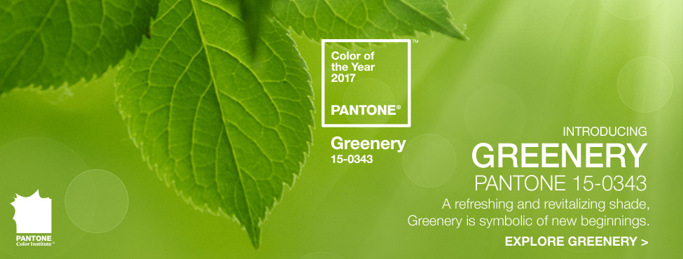
Pantone announced "colour of the year" back in the last month of December 2016 but sadly we couldn't agree on Pantone's decision for selecting Zesty Greenery as the colour of 2017.
We are surprised, as our trend team is unable to validate its significance either at the streets, retail or at the catwalk. According to Pantone the decision for selecting "greenery" as the colour of the year, as its represent peace, harmony, power of revitalization. Greenery is combination of yellow and green which is all about the start of spring season
Greenery was always the part of the colour palette and will be even for the 2018 and onward, unlike emerald (Pantone’s top colour for 2013), soft green is tough for most people to pull off. Unless you’re a redhead, don’t bother investing too much in this trend.
After analysing millions of SKU, from eCommerce, and our in-depth analysis of the street's trend, bricks & mortar retailers we are unable to validate its commercial relevance to be successful in coming months. According to our analysis only we have found only 1% designers preferred greenery at the ss17 runway shows at Milan, Paris, London, New York, New Delhi and Mumbai.
Pantone being the industry expert on all things colour, but it may have missed the mark on its latest pick for colour of the year. While there were glimpses of Greenery on the runway, the light yellow-green hue described as “zesty”, and “fresh” took a back seat to rosy pinks, powder blues, buttercup yellows and classic black-and-white combos. Unlike emerald (Pantone’s top colour for 2013), soft green is tough for most people to pull off. Unless you’re a redhead, don’t bother investing too much in this trend.
Catwalk colour Trend S/S17
Our team has analysed catwalk trends from the major global runway shows like Milan, Paris, New York, London, and New Delhi. After analysing more than 3000 collections from the 200 designers we have reached the conclusion, shades of blue and Pink are creating the buzz this time.