Every autumn, Apple's choice of iPhone colors becomes a cultural Rorschach test — a window into where consumer desire is heading. For most brands, color selection remains a mix of gut feel and mood-boarding. F-Trend's Color Intelligence platform does something different: it cross-references runway data across hundreds of global fashion houses, then maps those signals onto consumer product categories with machine-learning precision. For the iPhone 18 Pro Max's three new colorways — Meteorite, Italian Plum, and Placid Blue — the data paints a picture that is at once validating and cautionary.
Two of the three colors are at peak multi-year momentum. The third is heading for a cliff edge. Here's what the numbers reveal.
At a Glance
Three colors, three very different stories
Based on AW26 runway occurrences, growth trajectories, and AW27 projections, here is the headline verdict from the F-Trend platform:
The gap between Meteorite's 7,341 AW26 runway appearances and Placid Blue's 10 is not a rounding error — it is a chasm. And it raises a question worth asking: when the world's most valuable company chooses a color that the entire fashion industry has already walked away from, what does that say about Apple's color intelligence?
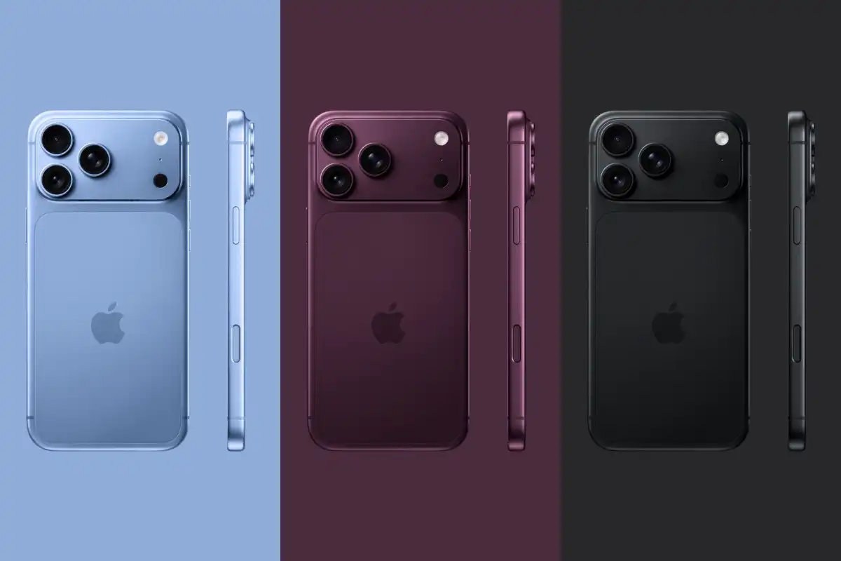
Color 01 — Meteorite
The color that will define a generation of devices
Meteorite is not simply a dark grey — it is the culmination of a multi-year shift toward what F-Trend calls industrial-grade luxury. Once a utility shade, it now commands the runway at Loewe, Givenchy, and Kiton with a sophisticated confidence that standard black can no longer claim.
What makes Meteorite exceptional for a consumer electronics context is its 92% Consumer Tech vector — the highest of any color in this report. This is a shade that has been organically adopted by the premium device market as the definitive replacement for standard black. Matte hardware, precision-machined aluminium, architectural minimalism: Meteorite owns all of it.
With a projected peak of 9,356 runway occurrences in AW27, Meteorite is not a trend — it is a new foundational anchor for premium aesthetics. Apple's decision to put it on the iPhone 18 Pro Max is commercially smart and strategically timed to land precisely at this color's zenith.
"Meteorite will command over 26% of the premium market share by AW27, signaling a consumer appetite for permanence and versatile sophistication amidst a volatile economic landscape."
F-Trend Color Intelligence Platform, Apr 2026Color 02 — Italian Plum
The fastest-growing luxury color in America right now
Italian Plum sits at the intersection of dark academia, moody intellectualism, and elevated quiet luxury — a trio of aesthetics that has been building in American retail for three consecutive seasons. Seen at Federica Tosi, Dries Van Noten, and BOSS, this is a color that signals something.
At +158% growth, Italian Plum is the most rapidly ascending color in the entire F-Trend dataset for this period. It is transitioning from niche luxury accent to dominant commercial force — the kind of shift that only happens once every few years, and which Apple appears to have spotted early.
The "Quiet Luxury" convergence
Italian Plum's rise is entangled with a broader cultural shift in how American consumers think about spending. In an economic environment where ostentatious display feels increasingly tone-deaf, moody sophistication has become the new status signal. A darkened plum iPhone, like a cashmere overcoat in the same shade, says I know something you don't — and that is exactly the frequency luxury is broadcasting on right now.
Italian Plum's consumer tech vector of 40% — lower than Meteorite's 92% — is not a weakness. It means Apple is arriving at the vanguard, not the tail end. By the time Italian Plum fully saturates the device category, the iPhone 18 Pro Max will have owned it first.
Color 03 — Placid Blue
The beautiful color that the data says nobody wants anymore
Placid Blue is aesthetically lovely — its muted, periwinkle-adjacent softness was central to the Coastal Grandmother and Soft Minimalist movements that dominated American retail from 2023 through SS26. The problem is that those movements have run their course, and the runway data is categorical.
Placid Blue hit its runway peak at SS26 with 54 appearances — a modest number even at its zenith — before collapsing to 10 in AW26 and heading for zero projected appearances by AW27. This is not a gentle decline; it is a full category exit. The fashion industry has spoken with unusual clarity: this serene-blue moment is over.
| Season | Meteorite | Italian Plum | Placid Blue |
|---|---|---|---|
| AW25 | 4,795 | 93 | 12 |
| SS26 | 5,428 | 147 | 54 ↑ peak |
| AW26 | 7,341 ↑ | 243 ↑ | 10 ↓ |
| AW27 (projected) | 9,356 ↑ | 612 ↑ | 0 ↓ exit |
"By 2027, this specific tint will lose its commercial edge to more utilitarian grays and muted earth tones. Brands should view current inventory as a final opportunity to capture the tail end of the serene-blue cycle."
F-Trend Color Intelligence Platform, Apr 2026Comparative Analysis
What the velocity curves tell us
When you plot all three colors' runway trajectories together, the divergence becomes viscerally clear. Meteorite is a near-vertical ascent. Italian Plum is a steep acceleration that has barely begun. Placid Blue peaked quietly and then vanished.
The scale compression required to show Meteorite and Placid Blue on the same chart says everything. Even at Meteorite's scale ÷100, Placid Blue barely registers in the final seasons. Within the lower two, Italian Plum's exponential curve against Placid Blue's terminal decline tells the rest of the story.
Strategic Implications
What this means for Apple — and for you
Apple's color selection tells two stories simultaneously. The first is sophistication: Meteorite and Italian Plum are precisely the right choices for a moment defined by premium restraint and the rejection of flashy minimalism. Both will age well through the device's three-to-four-year upgrade cycle.
The second story is more puzzling. Placid Blue's inclusion suggests either that Apple's internal trend intelligence missed the exit signal or that the company made a deliberate choice to serve a segment that prefers calming tones regardless of runway momentum. Both are plausible — but only one is strategically defensible at the Pro Max price point.
The consumer archetype question
F-Trend's platform maps each color to a consumer archetype. Meteorite belongs to the Urban Architect — the professional who prioritizes durability, modularity, and a refined aesthetic that transcends seasonal fads. Italian Plum belongs to the Discerning American Professional — someone who blends quiet luxury with a moody intellectual edge. Both archetypes index heavily toward the Pro Max buyer.
Placid Blue's archetype — the Quiet Luxury enthusiast who prioritizes mental clarity and soft approachability — is a real segment. But at $1,299+, you want to be chasing the Urban Architect and the Discerning Professional, not the Coastal Grandmother who peaked in 2024.
Final Verdict
Buy the dark one. Buy the plum one. Think twice about the blue one.
The broader lesson goes beyond Apple. Color is not decoration — it is market intelligence compressed into a wavelength. Brands that read it well gain years of commercial advantage. Brands that miss it end up with inventory in shades nobody wants.
2.5M+ runway data points · 500+ global brands · 98% forecast accuracy